A military challenge coin carries a different kind of pressure than many custom metal products. It may be handed across a desk, presented after a deployment, sold for a unit fundraiser, or kept quietly in a drawer for years. The coin has to look good, but it also has to feel appropriate. That means the design process should balance symbolism, restraint, durability, budget and presentation.
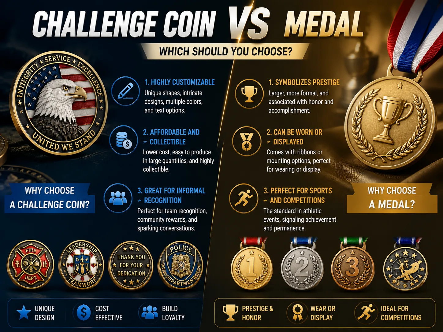
This guide explains how units, veterans groups, public safety teams and defense-related organizations can plan custom military challenge coins with fewer revisions and better results. It also links to related PinsCraftPro pages, including military challenge coins, custom challenge coins, the coin edge options guide and the comparison of custom challenge coins versus medals.

Begin With the Coin’s Purpose
The purpose of a challenge coin should guide every design decision. A command coin usually needs a formal tone, strong emblem placement and a finish that feels substantial. A deployment coin can include dates, location, mission nickname and shared imagery. A memorial or retirement coin should feel quieter and more timeless. A fundraising coin can carry bolder graphics if it still respects the audience and the story behind the piece.
When the purpose is unclear, designs tend to become crowded. Everyone wants to add one more symbol, one more motto, one more date and one more badge. A better approach is to write one sentence before the artwork begins: this coin honors what, for whom and on what occasion. That sentence becomes a filter. If an element does not serve it, the design can probably live without that element.
Respect Symbols, But Do Not Let Them Fight
Military-related coins often include unit crests, flags, aircraft, ships, vehicles, maps, ranks, mottos, dates, shields or service references. These can be powerful, but they need visual hierarchy. The front side should usually carry the primary identity. The reverse side can hold secondary details, a motto, event text or a more narrative image. Trying to make both sides do the same job can make the coin feel repetitive and crowded.
If official insignia or protected marks are involved, buyers should make sure they have the right permission to use them. If not, a supplier can still create a respectful design using original symbols: silhouettes, abstract lines, compass points, stars, geographic outlines, equipment shapes or typography. The goal is to capture the unit story without misusing marks that should not be reproduced.
Choose Size and Thickness With Handling in Mind
Most custom challenge coins are designed to feel weighty in the hand. A larger coin gives more room for detail and makes presentation stronger, while a smaller coin can be easier to carry and more budget-friendly. Thickness affects perceived value as much as diameter. A coin that is too thin may look fine in a flat proof but feel less substantial when handed to a recipient.
For detailed two-sided artwork, buyers often choose a size that allows text to remain readable without making the coin oversized. If the artwork includes a vehicle, building or complex crest, consider simplifying the background rather than increasing size endlessly. Good challenge coin design is usually about controlled detail, not maximum detail.

Edge Style Changes the Character of the Coin
The edge is not only decoration. It frames the artwork and sets the tone before anyone reads a word. A standard edge feels clean and direct. A rope edge can feel traditional and ceremonial. A spur or wave edge can make the piece more energetic. Sunburst and oblique line edges add movement, while leaf-style borders can feel refined and formal.
If the artwork already has a busy outer ring, a quieter edge may be the best choice. If the center art is simple, a more detailed edge can add presence. For buyers comparing specific options, the coin edge options guide is the most useful next read.
Pick Finishes That Support the Story
Antique gold, antique silver, antique copper and antique bronze are common for military challenge coins because they bring depth to raised metal details. Polished finishes can look bright and official, but they may show reflections and fingerprints more strongly. Black nickel can create a modern look, especially when paired with vivid enamel. Dual plating can separate a central emblem from an outer ring, although it should be used with intention rather than added automatically.
Enamel color should be treated as emphasis. A coin does not need every color from a patch if the metal relief can carry some of the detail. Dark enamel can make gold or silver metal lines stand out. Bright enamel can highlight flags, team colors or mission references. Transparent enamel may work when the buyer wants texture to show through, but it should be tested in the proof because the final effect depends on the base metal.
2D, 3D and Relief Decisions
Two-dimensional coin art uses raised and recessed levels to separate shapes clearly. It is excellent for logos, crests, text, borders and clean symbols. Three-dimensional relief adds sculpted depth, which is useful for faces, vehicles, animals, monuments or realistic objects. Many strong coins combine both: crisp 2D text and borders with a 3D center image.
3D detail can make a coin feel premium, but it also requires clear source material and enough space. A small coin with too many 3D elements may lose clarity. If the design has to include a portrait, aircraft, ship or building, prioritize the most important form and simplify the background. The proof should show how the sculpted surfaces will rise and fall, not only where color will be placed.
Use Text With Discipline
Coin text needs to survive at actual size. Long mottos, full names, dates, locations and slogans can all be meaningful, but not every word belongs on the coin face. A short motto around the outer ring often works. A longer dedication may belong on the reverse side, on a presentation card or in a box insert. If the coin is for a ceremony, the speaker can tell the story; the coin only needs to hold the most durable words.
Lettering should avoid overly thin fonts. Bold serif or sans-serif type often performs better than decorative fonts, especially around curved edges. The proof should be checked at 100 percent size. If someone has to zoom in to read the text, the recipient will have the same problem in hand.

Presentation Is Part of the Message
A challenge coin can be delivered loose, in a pouch, in a capsule, on a card, in a velvet box or in a display case. The best choice depends on how the coin will be used. If it is traded or carried, a pouch may be enough. If it is awarded in a formal setting, a box creates a stronger moment. If it is sold for fundraising, packaging can explain the story and protect the coin during shipping.
Presentation packaging should not feel like an afterthought. It can include the unit name, event date, short message, reorder information or QR code for a campaign. For recognition programs, consistent packaging helps each recipient feel the same level of care. For retail or fundraising, it helps the buyer understand why the coin is worth keeping.
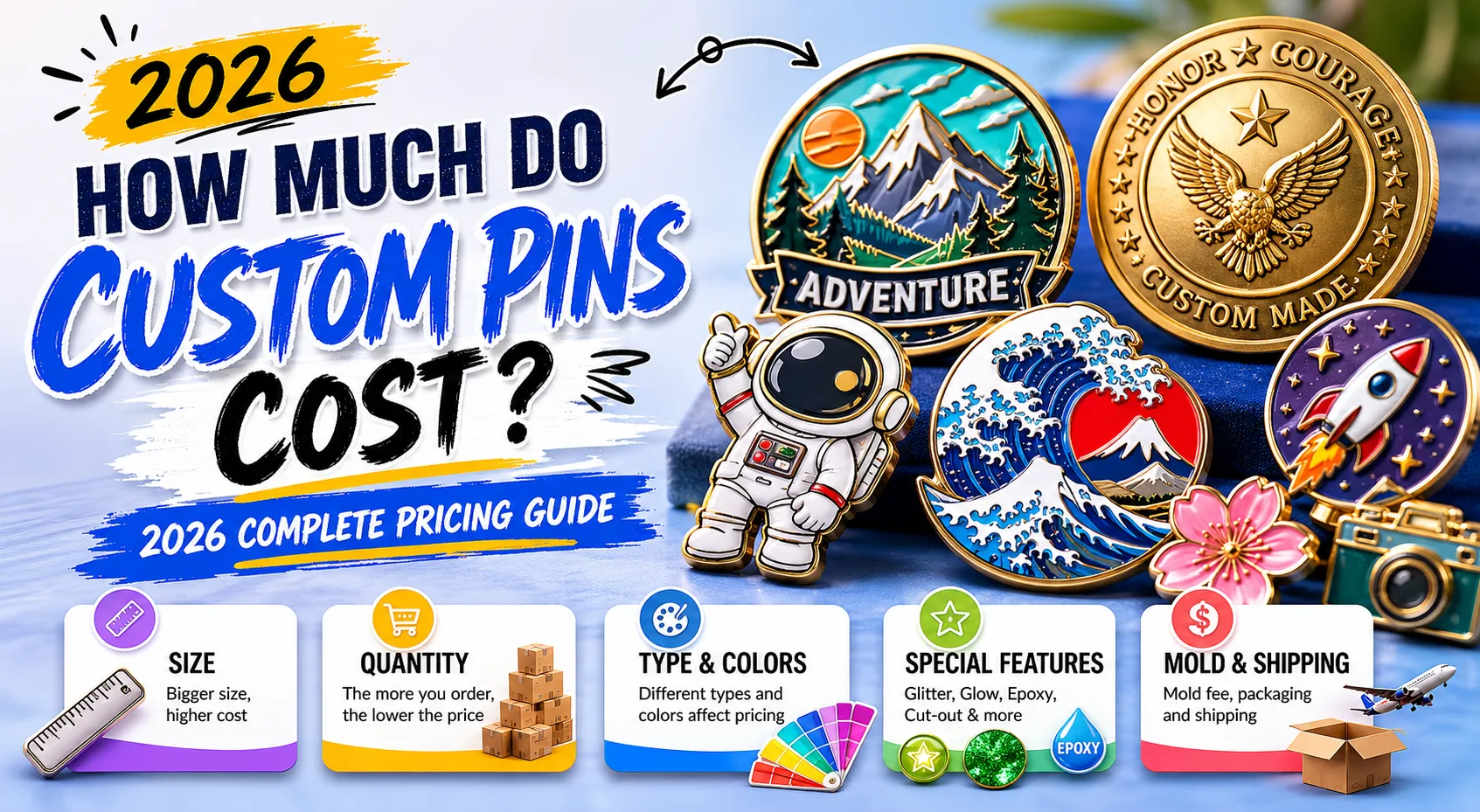
Budget: What Usually Moves the Price
Challenge coin pricing is usually influenced by size, thickness, quantity, mold complexity, number of sides, enamel colors, 3D sculpting, edge style, plating, numbering, packaging and shipping speed. Quantity often has a major effect because mold and setup costs are spread across more pieces. A larger coin with two-sided 3D relief and premium packaging will naturally cost more than a simpler one-sided 2D coin.
The lowest price is not always the best value. A coin that arrives late, feels thin or loses detail can damage the purpose of the order. A better target is appropriate value: spend where the recipient will notice, simplify where the detail does not serve the story. If the budget is fixed, share that range early so the supplier can recommend the right combination of size, finish and packaging.
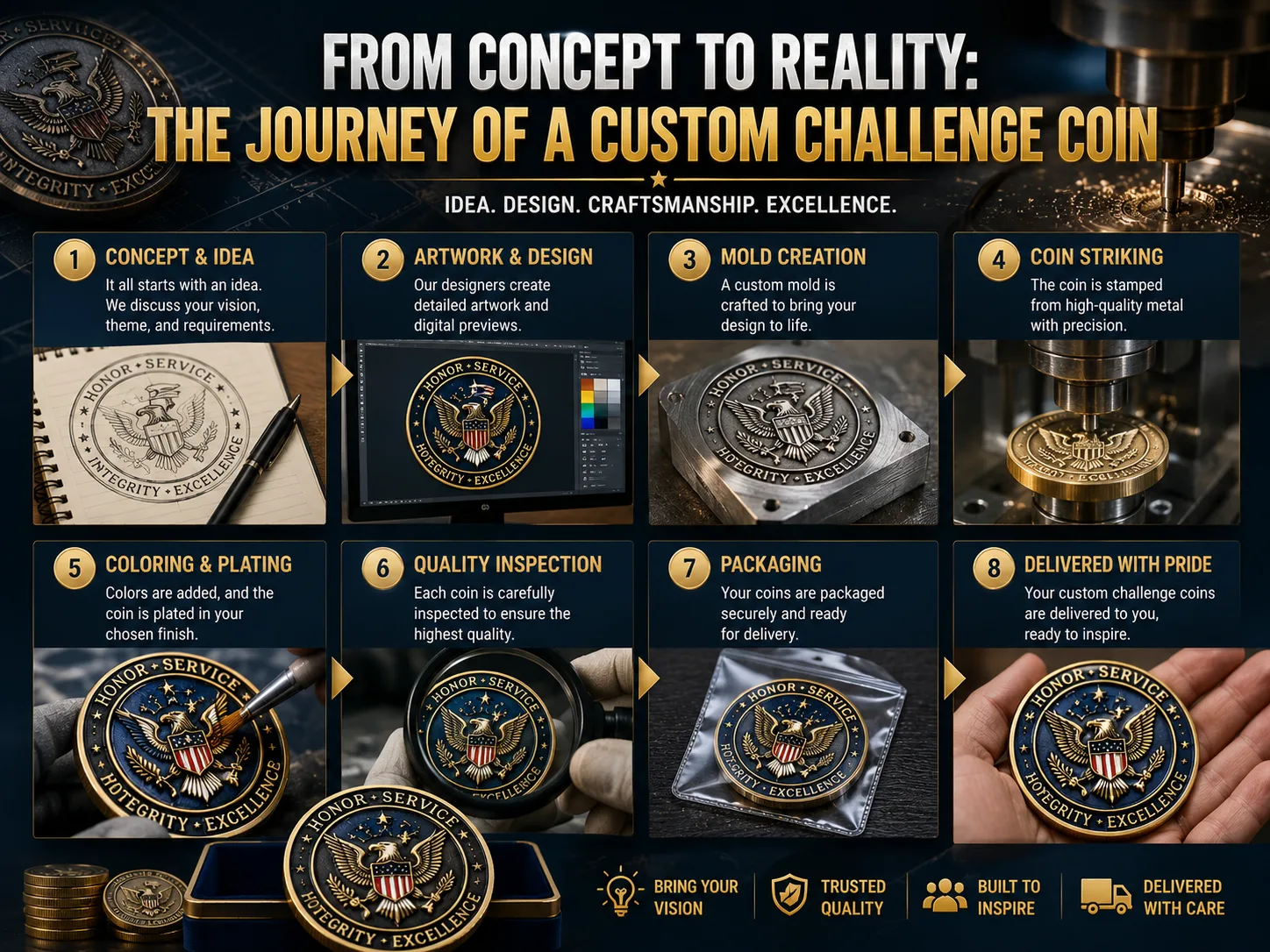
Ordering Workflow That Reduces Revisions
A useful order request includes the coin purpose, quantity, deadline, preferred size, finish ideas, artwork files, required text, packaging preference and shipping destination. If there are must-use symbols, label them clearly. If there are optional ideas, separate them from required elements. This helps the designer build a proof that respects priorities instead of guessing what matters most.
During proof review, check spelling, ranks, dates, acronyms, unit names, coordinates and all formal wording carefully. A typo on a coin is more serious than a typo in a temporary flyer because the object may be kept for years. It is worth having more than one person review the proof, especially someone who understands the official names and abbreviations.
Use an Approval Checklist for Sensitive Details
Military and service-related coins often involve names, symbols and wording that deserve a more careful approval process than ordinary merchandise. Before production, confirm that every official reference is allowed, every acronym is correct and every date matches the event being commemorated. If the coin includes a motto, verify capitalization and punctuation. If it includes a location, verify spelling and whether the place name should be formal, abbreviated or omitted for privacy.
It is also wise to separate creative preference from factual approval. A committee may debate whether antique silver or antique gold looks better, but factual details should be checked by someone who owns that responsibility. This is especially important for retirement, memorial, deployment and command coins. The recipient may not notice a small plating debate, but they will notice if a name, rank, unit title or year is wrong.
A short approval checklist can include: authorized artwork, correct unit or organization name, approved motto, confirmed dates, readable text size, accepted finish, accepted edge, accepted packaging, quantity, shipping address and in-hand deadline. The checklist is simple, but it protects the meaning of the finished coin.
Match the Coin to the Audience
A coin for active service members may be designed differently from a coin for families, donors, alumni, museum visitors or corporate partners. Active members may value accuracy, restraint and symbols that reflect shared experience. Fundraising audiences may need a clearer story and packaging that explains the purpose. A retirement or memorial audience may expect a quieter design with more attention to presentation.
This does not mean creating a different coin for every group. It means choosing design language that respects the primary audience. If the coin will be sold publicly, avoid overly insider references that leave supporters confused. If the coin is only for a unit ceremony, insider references may be exactly what makes it meaningful. The strongest designs know who will hold the coin first.
Common Mistakes to Avoid
- Using too many symbols without a clear visual hierarchy.
- Approving text that looks readable only when the proof is zoomed in.
- Selecting a complex edge when the outer ring is already crowded.
- Forgetting to plan packaging for formal presentation or resale.
- Waiting too long to begin the order and then compressing proof review.
FAQ
What is the best finish for a military challenge coin?
Antique gold, antique silver, antique bronze and antique copper are popular because they show raised and recessed details well. The best finish depends on the artwork, tone and presentation setting.
Should the coin be 2D or 3D?
Use 2D for clean logos, text, borders and graphic symbols. Use 3D for sculpted objects, portraits, vehicles or monuments. Many strong coins combine 2D lettering with a 3D center image.
How can a unit make the coin feel more premium without overspending?
Focus spending on thickness, a strong antique finish, clean proofing and appropriate packaging. Simplify tiny details that will not be noticed, then use the saved budget where recipients can feel the difference.
Final Takeaway
A well-planned military challenge coin feels deliberate. It does not need every possible detail; it needs the right details, organized with respect for the people and event behind the order. When purpose, symbolism, finish, edge style, text and packaging work together, the final coin can carry meaning long after the ceremony ends.
For the next step, visit military challenge coins or compare broader options on the custom challenge coins page.