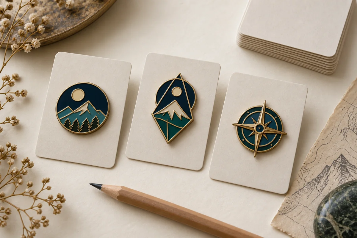




Custom healthcare pins can mark a service anniversary, welcome a new nursing cohort, thank a volunteer team, or make a fundraising campaign feel more cohesive. The small format is useful because it can carry a shared symbol without turning recognition into a bulky award. It is also unforgiving: crowded text, an unclear purpose, or an unsuitable attachment becomes obvious once the pin is produced at actual size.
A strong program therefore begins with the recognition moment rather than the product. Decide who receives the pin, what the recipient should understand, where the item may be worn or displayed, and whether the design must work for one campaign or a series. Only then should the team choose enamel type, dimensions, plating, backings, packaging, and quantity.
This guide is for hospital communications teams, nursing schools, clinics, associations, nonprofits, and employee-recognition buyers planning custom healthcare pins. It covers the decisions that belong in the brief and the proof, while avoiding universal claims about factory limits. Exact dimensions, tolerances, materials, testing, pricing, and production schedules should always be confirmed for the specific artwork and order.
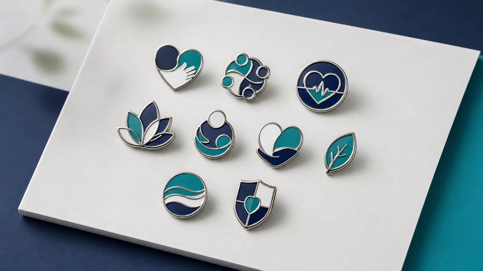
Quick answer: how should a healthcare pin program be planned?
Start with a single sentence: “This pin helps this audience recognize this contribution or milestone at this moment.” That sentence is more useful than asking for a “premium medical pin” because it gives the designer a hierarchy. A five-year service pin needs a clear milestone. A nursing-school cohort pin needs group identity. A volunteer pin may need warmth and broad readability.
For most programs, use this order of decisions:
- Define the recipient, occasion, and distribution setting.
- Confirm whether the pin may be worn on uniforms or only on non-clinical apparel and accessories.
- Select one primary symbol and one short supporting detail.
- Review the design at finished size before choosing the process.
- Approve the front, back, attachments, packaging, quantity, and delivery plan together.
If the program is part of a broader recognition system, the employee recognition pin planning guide explains how milestones, tiers, replacement rules, and inventory can work across several years.
Why healthcare is a timely sector for recognition merchandise
Recent promotional-products research offers useful context, although it should not be treated as a promise of results for any individual campaign. In an August 20, 2026 release, the Advertising Specialty Institute reported that healthcare was the biggest gainer among the leading sectors served by promotional-product distributors, increasing its share of industry sales by two percentage points. ASI also noted broader movement toward practical and lifestyle-oriented categories.
The useful takeaway is not “order more items.” It is that healthcare buyers are actively using branded merchandise, so every object must earn its role. A recognition pin should connect to a specific audience, behavior, milestone, or community. That principle also matches PPAI’s August 2026 industry guidance, which encourages marketers to connect merchandise to a business goal, audience, and moment instead of treating it as a last-minute product purchase.
Planning implication: write the intended outcome into the brief. Examples include improving visibility for a volunteer program, giving graduates a shared keepsake, or creating a consistent service-award system. Do not use an industry trend as a substitute for a program objective.
Choose the recognition moment before the pin style
Healthcare organizations contain many audiences, and a design that works for one may be inappropriate for another. A concise program map prevents unrelated requirements from being pushed into a single pin.
| Program type | What the pin needs to communicate | Design priority | Operational question |
|---|---|---|---|
| Service milestone | Years, contribution, and continuity | Clear tier or date system | Will the design remain available for future recipients? |
| Nursing cohort or graduation | Shared identity and achievement | School-approved mark and readable year | Who owns final brand approval? |
| Volunteer recognition | Belonging and appreciation | Warm, inclusive visual language | Will the pin be mailed, presented, or used at events? |
| Department or specialty team | Team identity | Distinct symbol within a common system | Should future departments use the same outline? |
| Awareness campaign | Campaign recognition and participation | Simple symbol and controlled color | Are any symbols, names, or colors legally restricted? |
| Donor or partner thank-you | Relationship and shared mission | Presentation and perceived care | Is a backing card or gift box part of the message? |
When two audiences require different information, create a coordinated family rather than shrinking everything into one design. A common outer shape, plating, or color can provide continuity while the center symbol changes.
Build a symbol system, not a collage
Healthcare artwork often accumulates too many cues: a heart, hands, a pulse line, a building, a department name, a year, and an organization logo. At pin scale, those elements compete. Select one dominant idea and let the remaining details support it.
A practical hierarchy has three levels:
- Primary recognition cue: the symbol or silhouette understood first.
- Identity cue: an approved logo element, initials, or color system.
- Program cue: a short milestone, year, or department indicator.
Review the artwork as a black silhouette before adding color. If the outline is generic or fragile, enamel will not solve it. Then print the design at 100% scale. Fine details that only work when zoomed in should be simplified, enlarged, converted to print, or removed. The Größenübersicht für Emaille-Anstecker provides a more detailed actual-size review method.
Select a production method that supports the artwork
The visual goal should lead the process choice. Hard enamel, soft enamel, die-struck metal, and printed details create different surfaces; none is automatically correct for every medical lapel pin.
Harte Emaille
Hard enamel creates a smoother, polished surface. It can suit formal service awards, alumni pieces, and clean geometric logos. Small color fields still need enough room for metal borders, and the finished result should be evaluated together with plating and edge treatment.
Weiche Emaille
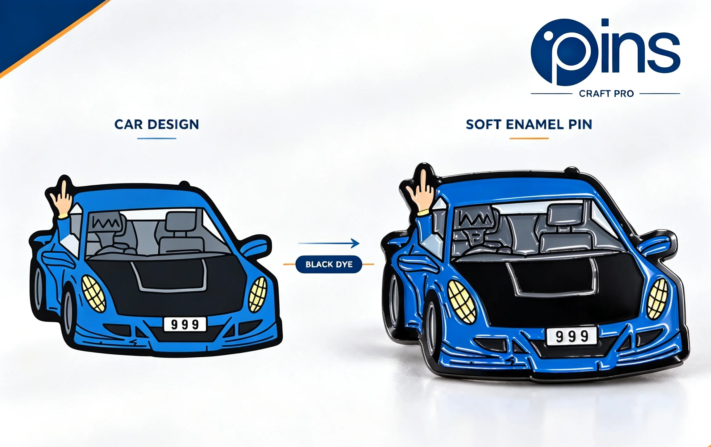
Soft enamel leaves the metal lines raised above recessed color areas. The tactile separation can help a bold symbol feel more dimensional. It is useful when the design benefits from visible metal structure rather than a completely level face.
Die-struck metal
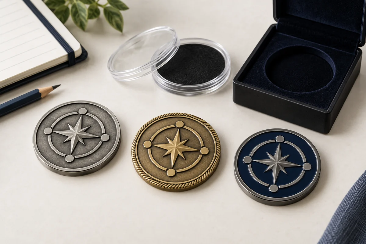
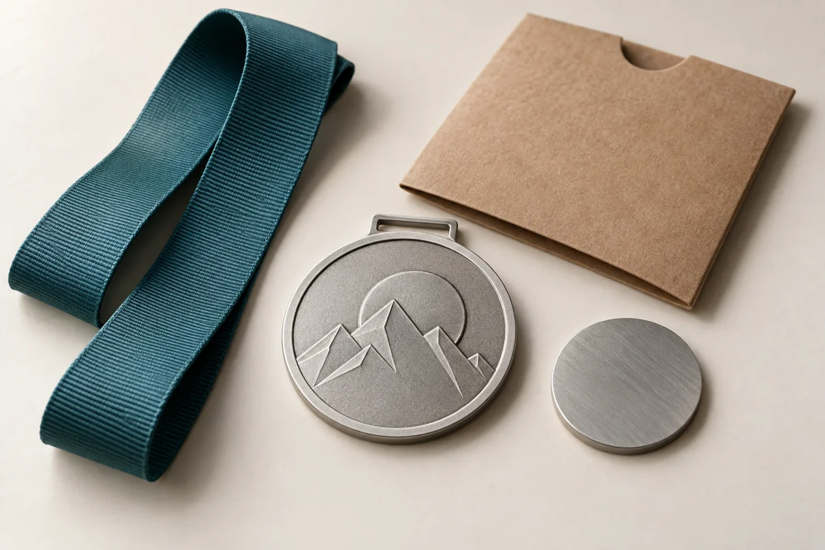
An uncolored die-struck approach can feel restrained and ceremonial. Raised and recessed metal, texture, and finish carry the image. This direction often works best when the design does not depend on multiple campaign colors.
Printed or hybrid details
Printing may preserve gradients, tiny identifiers, or details that would otherwise require crowded metal lines. It should be used deliberately, with a proof that shows which elements are enamel, metal, or print. Compare the options in the hard enamel versus soft enamel guide before approving a process based only on a screen mock-up.
Make text survive the finished size
A long hospital name or program slogan can dominate a small pin. If full wording is essential, consider a larger backing card for the explanation and keep the pin itself focused. Initials are only useful when recipients already understand them.
Check text with these questions:
- Is every word necessary to recognize the program?
- Can the shortest approved name replace the formal legal name?
- Will the text be formed in metal, printed, or omitted from the pin?
- Are counters inside letters and spaces between strokes open at actual size?
- Does the same information already appear on the presentation card?
Do not approve from a large monitor view. Request a proof with finished dimensions and print it without scaling. If several people review the project, use the custom pin artwork proof checklist so each approver examines the same items.
Use color to organize the program
Color can distinguish departments, years, award levels, or campaigns, but too many variants create inventory and approval problems. Begin with the organization’s controlled palette and identify which colors are mandatory, which may shift to match enamel availability, and which are decorative.
A scalable system might keep the outline and plating constant while changing one enamel field for each milestone. Another might use one organization color for all pins and place the year on the backing card. The better structure is the one the team can reorder correctly.
Screen colors are not physical standards. Provide Pantone references or another agreed color specification when color consistency matters, then ask how the supplier translates that reference into the chosen process. The Pantone color matching guide explains why monitor appearance, enamel, print, and plating should be reviewed separately.
Match pin size, weight, and posts to the use
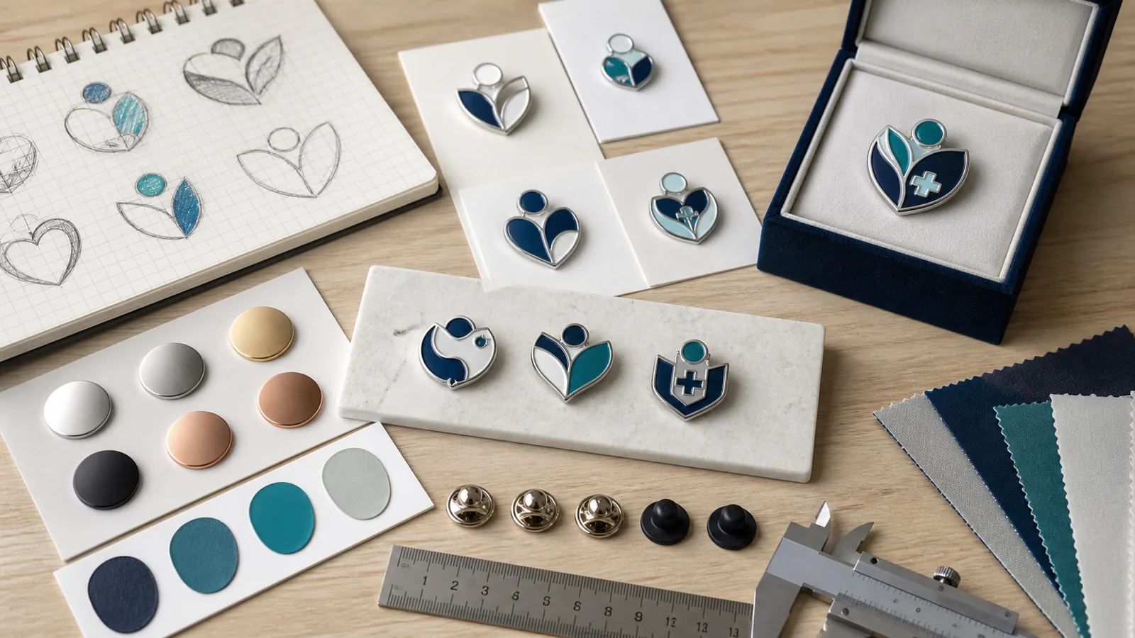
A compact pin may be comfortable for a lapel but too small for a multi-line seal. A large pin provides more art space but adds weight and leverage. Long horizontal designs can rotate around one centered post; tall designs may lean if the post sits too low. Post count and position should be shown on the back view of the proof.
Do not assume thicker metal automatically creates a better wearable pin. Thickness, outline, base metal, dimensions, posts, and clutch type work together. For a detailed side-profile comparison, see the Leitfaden zur Dicke von Emaille-Ansteckern.
Check uniform and clinical policies before choosing a backing
Not every workplace permits pins on clinical uniforms, protective garments, or areas where attachments could snag, become loose, or interfere with infection-control procedures. Requirements vary by organization, role, and setting. The program owner should confirm the applicable dress code and safety policy before telling recipients where to wear the item.
If uniform wear is not appropriate, the pin can still be presented for use on a jacket, tote bag, lanyard card, display board, or keepsake card where permitted. This is an operational decision, not a medical claim.
Common attachment discussions include butterfly clutches, rubber clutches, locking mechanisms, magnets, and multiple posts. Each option has trade-offs in profile, grip, convenience, and intended surface. Magnets may also be unsuitable for some recipients or settings, so the buyer should conduct the relevant policy review. The pin backing and packaging guide offers a broader comparison.
Protect symbols, names, and claims during approval
Healthcare imagery is not a free library. Some emblems, organizational marks, professional insignia, school seals, and campaign names are protected or require permission. The red cross emblem has special legal protections in many jurisdictions and should not be treated as generic decoration. A color change is not a substitute for a proper rights review when a design remains confusingly similar to a protected symbol.
Keep a simple approval record showing:
- Who supplied each logo or mark
- Who confirmed the right to reproduce it
- Which brand guide and color references were used
- Who approved the final front and back proof
- Whether the wording makes any regulated, medical, safety, or charitable claim
A pin should recognize a program; it should not imply professional certification, clinical authority, safety performance, or charitable endorsement unless the organization has specifically authorized that meaning.
Design the presentation, not just the metal
The handoff changes how a recognition item is perceived. A pin passed across a desk in a plastic bag feels different from the same pin mounted on a card that names the milestone and explains why it matters. Packaging also protects posts, controls orientation, and keeps different award tiers separated.
Choose the lightest presentation that supports the moment. A volunteer event may need a recyclable card and simple protective bag. A retirement or donor program may justify a fitted box. A mailed program needs a pack-out test that accounts for the post, clutch, and exterior mailer.
Keep dated campaign language on a replaceable card when possible. The core pin can remain reorderable while cards change by location, year, or recipient group.
Plan one system for inventory and reorders
Recognition programs often continue after the first order. Record the artwork version, finished dimensions, process, base metal, plating, enamel references, post positions, back stamp, attachment, packaging, and approved sample. The custom pin specification sheet is designed for that record.
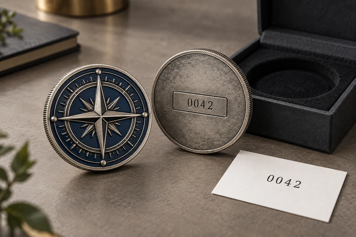
For tiered service awards, decide whether stock will be held centrally or by location. Set a reorder point based on actual usage and lead-time confirmation rather than guesswork. If names or dates are personalized, separate the reusable base design from the variable data and define how corrections will be handled before production.
Build the schedule backward from the recognition date
The delivery date is not the same as the ceremony date. Allow time for receiving, inspection, internal distribution, recipient sorting, and replacements. Before committing, ask the supplier to identify the current windows for artwork preparation, proof approval, sampling if required, production, packaging, and transport. These windows can change with design complexity, quantity, holidays, and logistics.
A practical approval chain names one decision owner and one backup. Consolidated feedback is faster and safer than sending conflicting edits from communications, HR, nursing leadership, procurement, and an external agency. The custom pin production timeline guide shows how to map the stages without relying on a universal lead-time promise.
Control the budget with the right levers
Unit price is affected by more than quantity. Dimensions, process, number of colors, plating, cut-outs, posts, individual personalization, packaging, sampling, and freight can all matter. Ask for comparable quotations rather than changing several variables at once.
| If the budget is under pressure | Review this first | Protect this |
|---|---|---|
| The design is too costly | Simplify dimensions, colors, cut-outs, or packaging | The primary recognition cue |
| There are too many versions | Move variable details to the card | The shared visual system |
| Mailing cost is high | Test package depth and weight | Post protection and presentation |
| Reorders are inefficient | Standardize the core design and specification | Version control and color references |
| The pin feels generic | Improve the symbol hierarchy or message | Relevance to the recipient |
A cheaper object that does not clearly represent the achievement is not efficient. At the same time, adding weight, colors, or a box without a program reason does not automatically increase meaning.
Measure the program after distribution
Recognition is difficult to evaluate with one number, but a small measurement plan is better than relying on anecdotes. Record how many eligible recipients received the pin, how many addresses or names needed correction, whether distribution happened on time, how many replacements were requested, and which designs were reordered.
For an internal program, a short recipient survey can ask whether the item felt relevant, whether the meaning was clear, and whether the preferred use was wearing, displaying, or keeping it. Avoid leading questions. The answers can improve the next milestone without pretending that a pin alone caused changes in retention, morale, or clinical outcomes.
Healthcare pin briefing checklist
- Program objective and recognition moment
- Recipient group and estimated quantity
- Approved organization name, logo files, and usage permission
- Primary symbol, essential text, and version structure
- Fertigbreite und -höhe
- Hard enamel, soft enamel, die-struck, printed, or supplier recommendation
- Plating and controlled color references
- Post count, post position, clutch, and intended display surface
- Uniform, safety, and policy review owner
- Back stamp or numbering requirements
- Backing card, bag, box, mailer, and pack-out instructions
- Delivery destination, inspection time, and recognition date
- Named proof approver and reorder record owner
Custom healthcare pins FAQ
What size should a nurse recognition pin be?
The size should follow the amount of artwork, intended surface, and wear policy rather than a job title. Print the proof at finished size, check text and thin gaps, then review weight and post placement with the supplier.
Can a hospital put its logo on a custom pin?
Yes, when the organization owns the mark or has permission to reproduce it and the use follows its brand rules. Keep the approval and source artwork with the production record.
Should healthcare recognition pins use hard or soft enamel?
Hard enamel suits a smoother polished look; soft enamel creates recessed color and raised metal texture. The best choice depends on artwork, desired surface, budget, and supplier feasibility.
Can staff wear pins on clinical uniforms?
That depends on the organization’s dress, safety, and infection-control policies and the recipient’s role. Confirm the permitted use before distribution and offer a non-clinical display option when needed.
How can one pin design support several departments?
Keep the outer shape, plating, and brand cue consistent while changing one central symbol, color field, or backing card. Record every version so reorders do not drift.
What files are needed for a healthcare pin quote?
Send vector artwork when available, finished dimensions, quantity, colors, process preference, attachments, packaging, destination, deadline, and any brand or symbol restrictions. If the artwork is not final, identify what must remain unchanged and invite a production recommendation.
Turn recognition intent into a production-ready brief
The most effective custom healthcare pins are not the ones with the most symbols or the heaviest metal. They are the ones whose purpose is obvious to the recipient, whose artwork survives at real size, and whose attachment and presentation fit the setting.
When the objective, artwork, quantity, packaging, destination, and recognition date are ready, review the custom pins manufacturing options und request a custom pin quote. Ask for every final decision to appear on the proof or specification sheet before production begins.
Industry sources consulted
- Advertising Specialty Institute, “2026 State of the Industry”, published August 20, 2026.
- Promotional Products Association International, “Merch Moves Us”, published August 24, 2026.
Editorial note: industry findings above are used as planning context, not as performance guarantees. The concept images in this article were created with ChatGPT Image and reviewed for relevance, brand safety, and accuracy of the accompanying captions.