




Pantone Color Matching for Custom Enamel Pins
Table des matières
GÉNIAL ! PARTAGER
Color is often the first thing a buyer notices about a pin and the last detail a production team wants to leave open to interpretation. A logo may look correct on a laptop, yet the finished épingles personnalisées can feel different once colored enamel sits beside polished gold, black nickel, or antique metal. The problem is rarely that one party “saw the color wrong.” More often, the order never established a shared physical reference.
Pantone color matching gives designers, buyers, and manufacturers a common vocabulary for opaque spot colors. It does not make enamel behave like a backlit screen, and it cannot eliminate every visual difference caused by finish, lighting, or production method. Used correctly, however, it removes a large amount of guesswork before tooling begins.
This guide explains how to build a practical color specification for custom enamel pins, how to review a proof, and when a physical sample is worth adding to the schedule.
Why a digital logo is not a complete color specification
RGB values describe light emitted by a screen. CMYK values describe ink combinations for print. Enamel is a pigmented material placed into a metal design, so neither an RGB screenshot nor a CMYK logo file guarantees a direct physical match.
Even two calibrated monitors can display a brand color differently. Email compression, presentation software, browser color management, and ambient office lighting add more variation. A buyer who writes “use the blue in our logo” is therefore asking a factory to make a judgment that should belong to the brand owner.
A better artwork package includes the vector logo plus named spot-color references. For many corporate and team projects, those references are selected from the Pantone Solid Coated library because its coated swatches provide a familiar visual starting point for saturated product colors. The exact system should still be written on the proof; a number without the library name can be ambiguous.
What Pantone matching can—and cannot—control
A Pantone reference tells the production team which color target to pursue. It is strongest when the design uses opaque, solid fills. It is less suitable for effects that depend on transparency, sparkle, pearlescence, glow, or a gradual transition between colors.
Good candidates for named spot colors
- Corporate logos with one to five solid brand colors
- School, club, and nonprofit identity systems
- Flat character artwork with defined metal outlines
- Repeat orders that need a consistent written specification
Effects that need a different approval method
Gradients, photographs, very fine tonal changes, and shaded illustrations are normally better handled as printed details than as separate enamel cells. Buyers comparing techniques can review the épinglettes imprimées option before forcing complex artwork into a limited set of solid colors.
Specialty enamels also need an effect reference. Glitter particle size and density can change the apparent color. Translucent enamel allows the metal texture beneath it to influence the result. Glow pigments are usually judged both in normal light and after activation. In these cases, a Pantone number can describe the base hue, but a reference photo or physical sample should define the effect.
How pin construction changes color perception
The same color reference can feel different depending on the surface around it. That is why color approval should happen together with the choice of enamel process and plating—not as an isolated line item.
| Production choice | What the viewer sees | Color-planning implication |
|---|---|---|
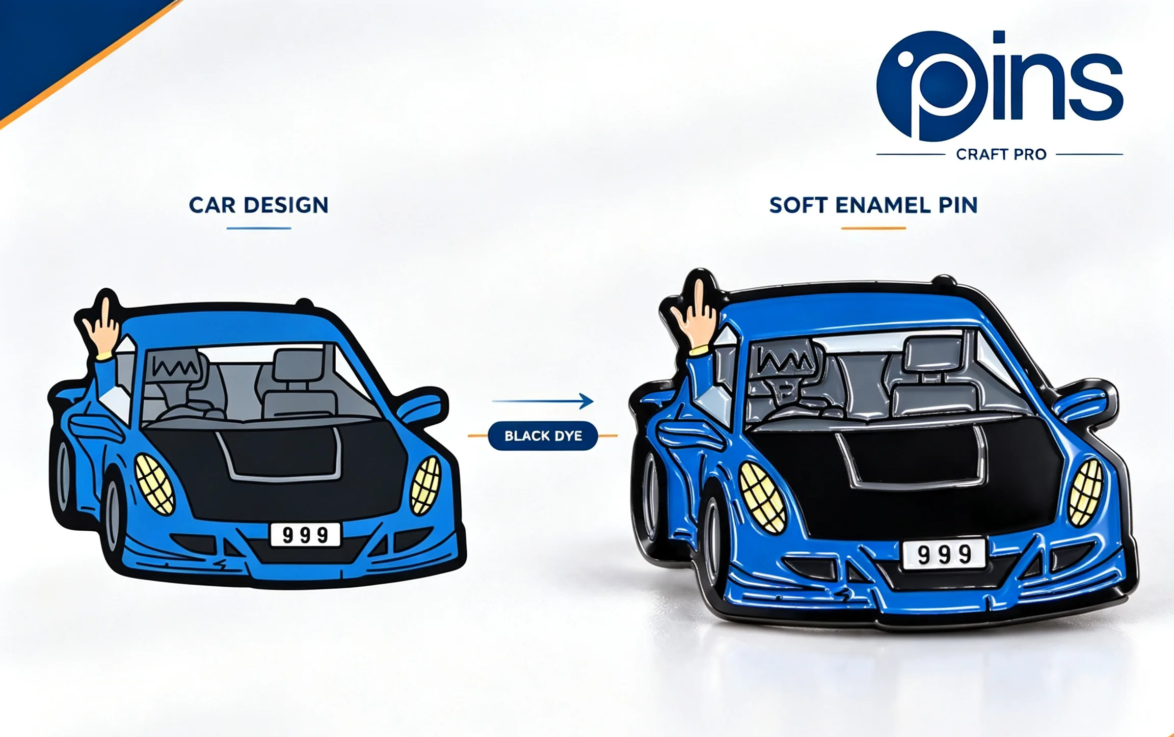
| Soft enamel pins | Recessed color areas separated by raised metal | Shadows and textured relief can make darker colors appear deeper. |
| Hard enamel pins | A smooth, polished surface where enamel and metal are nearly level | Colors usually read as cleaner blocks, while polishing and glare affect highlights. |
| Gold or copper-tone plating | A warm reflective border around each color cell | Warm metal can make cream, red, and yellow areas feel richer. |
| Silver or black nickel plating | A neutral or dark border with stronger contrast | Pale colors may feel brighter; dark colors may need enough separation. |
| Antique finish | Darkened recesses and lower overall reflectivity | Muted colors often suit the finish better than very clean digital hues. |
Pin size matters too. A narrow strip of navy enamel surrounded by bright metal will not have the same visual weight as a large navy field. Review colors in the actual-size artwork, not only in a zoomed-in proof.
Build the color specification before requesting a quote
A usable specification does not need to be complicated. It needs to make every decision explicit and traceable. The following sequence works for most brand, event, school, and merchandise orders.
- Start with approved vector artwork. AI, EPS, SVG, or editable PDF files preserve clean shapes and make color regions easier to identify.
- Reduce accidental duplicates. If two blues are meant to be identical, assign one swatch rather than leaving nearly identical values in the file.
- Name every opaque color. Write both the Pantone number and the specific library, such as Solid Coated, in the design notes.
- Separate enamel from metal. Do not use a yellow fill to represent gold plating unless the proof clearly labels it as metal.
- Describe specialty effects. Mark glitter, translucent, pearlescent, glow, transparent print, or screen-printed details separately.
- Set a decision owner. One person should consolidate stakeholder comments and approve the final proof.
Record these choices in a reusable custom pins specification sheet. The document becomes especially valuable when a purchasing team reorders the design months later or sends it to a new regional office.
How to review the artwork proof for color
A proof is a manufacturing map, not just a prettier version of the logo. Review it at two scales: enlarged for technical accuracy and at the intended finished size for visual balance. The artwork proof checklist covers the broader approval process; for color specifically, check the following items.
- Every color region has a label, and the labels match the written specification.
- No small area has been merged into a neighboring color without approval.
- Metal lines clearly separate enamel colors that cannot share one cell.
- The plating finish is named rather than represented only by a simulated color.
- Printed details are distinguished from enamel fills.
- The proof includes the final size, because scale changes color balance.
- Front and back views do not conflict about metal or attachment placement.
Do not approve based on the rendered preview alone. A digital rendering is helpful for composition, but the written labels are the production instructions. If the label says one color while the screen preview resembles another, correct the label or ask for clarification before approval.
When a physical sample is worth the extra step
Many straightforward designs can proceed from an approved production proof. A pre-production sample becomes more valuable when color is commercially critical or when several variables interact.
Consider a physical sample for a retail launch with strict brand standards, a design using more than one specialty enamel, a translucent color over textured metal, or a large repeat program distributed across multiple locations. A sample may also be sensible when packaging, fabric, or printed collateral must coordinate closely with the pin.
Evaluate the sample under at least two realistic lighting conditions. Office LEDs, daylight, warm event lighting, and retail spotlights can each change perceived color. Compare it with a current physical brand standard rather than with a phone screen. If several reviewers are involved, have them inspect the same sample instead of circulating different photographs.
Common color problems and how to prevent them
“The finished color looks darker than the screen”
Screens emit light; enamel reflects it. Compare the pin with a physical swatch in neutral lighting and consider the influence of recessed soft enamel or dark plating before deciding that the batch is outside the approved target.
“The reorder is close, but not identical”
Minor batch variation is possible with physical materials. Keep the previous approved specification, proof, order number, and—when consistency is critical—a retained sample. Ask the manufacturer to treat the new order as a repeat rather than rebuilding the design from a screenshot.
“Two colors merged at production size”
This is usually a geometry issue rather than a color-matching issue. Adjacent enamel colors need a separating metal line unless a printed method is used. Simplify the region, increase the pin size, or convert the fine detail to print.
“The brand color clashes with the plating”
Review plating and enamel together early. A warm gold border can be beautiful, but it may shift the visual character of a cool palette. Request a proof showing an alternative such as silver or black nickel before tooling.
A practical approval checklist for buyers
- Vector artwork is attached and matches the latest brand file.
- Every solid fill has a named color reference and library.
- Plating is specified independently from enamel color.
- Special effects and printed details are clearly marked.
- The proof has been reviewed at actual finished size.
- One authorized person has issued a clear written approval.
- The final proof and specification are stored for reorders.
Frequently asked questions
Can custom enamel pins match a brand color exactly?
A named physical color reference creates a reliable target, but enamel, metal, finish, lighting, and normal batch variation affect perception. For color-critical programs, approve a physical sample and retain it with the order records.
How many enamel colors should a pin use?
There is no universal ideal. Many clear, economical designs use two to five colors. More colors can work when the pin is large enough and the artwork provides sufficient metal separation. The decision should follow legibility and brand needs rather than an arbitrary maximum.
Should gradients be converted into several Pantone colors?
Only when a stepped, poster-like interpretation is acceptable. If the gradual transition is important, a printed process usually preserves the artwork more faithfully than dividing it into multiple enamel cells.
Final takeaway
Good color control begins before manufacturing. Give the supplier an approved vector file, named color references, a clear plating choice, and written instructions for every special effect. Then review the proof as a technical document and save the approved version for future orders. That workflow turns color from a subjective email discussion into a manageable production standard—and makes custom enamel pins easier to approve, repeat, and scale.
Articles connexes